
Design

My design work are all answers to problems I observe around me. I challenge the status-quo by attempting to combat sexism, racism, environmental degradation, political corruption, ableism and all forms of discrimination through thoroughly researched design outcomes.

I am a social service designer trained in design research, environmental and social sustainability and systems thinking.

My education from Lancaster University: B.A Design Honors and Aalto University: M.A Creative Sustainability in Design laid the foundations for my growth in the design realm.

Currently, I am further developing, researching and producing my latest project ‘The Sex-Ed Kit’.

I

The Sex-Ed Kit

Playful design for difficult conversations

Master's thesis, Aalto University · 2024

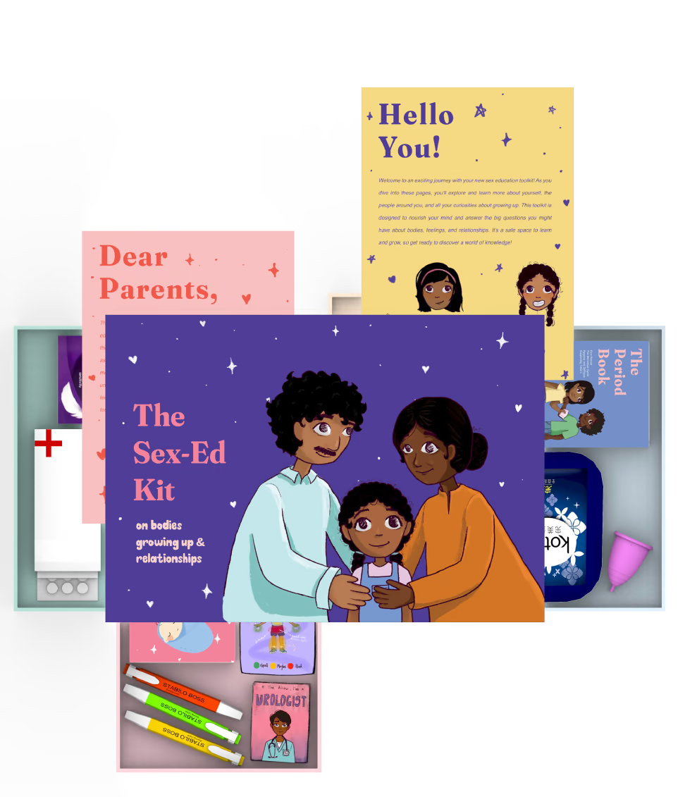
The Sex-Ed Kit is an activity-based toolkit that makes sex education approachable, engaging, fun and — most importantly — inclusive, for children and adolescents aged 4 to 13. Through age-appropriate games, activities and discussions, it helps parents and guardians navigate the conversations that matter most: body safety, consent, puberty and healthy relationships, in a comfortable, stigma-free environment.

It started with growing up in Kerala, and with a question I could not answer on my own — whether the silence I grew up inside was mine alone, or something a whole community shares. Focus groups with parents and children, colour-coded transcripts and a thematic analysis on Miro turned those conversations into the two questions the thesis actually asks: what makes sex education so hard to have between parents and children in India, and how playful design tools can carry that knowledge, ease the talking and hold a safe space open around it.

What came out of it is a boxed kit of categorised sections, with illustrated activity cards, markers, a letter to the parents, a letter to the child, and The Period Book. Every character in it was drawn from scratch so that the children using it would find themselves in it. Schools and NGOs can buy it in bulk and fold it into the sex education they already run.

Role
Sole researcher, designer and illustrator
Methods
Systems thinking and the iceberg model, focus groups, thematic analysis, co-creative brainstorming, prototyping
Made with
Adobe Illustrator, Procreate, Miro
Top view of the Sex-Ed Kit: a boxed toolkit with illustrated cards reading 'The Sex-Ed Kit — on bodies, growing up and relationships', a 'Dear Parents' letter and a 'Hello You!' letter fanned out above it

6 pages — swipe, or open one to read it

II

Vernacular Homes & Comfort

Vernacular design research

Dissertation, Lancaster University · 2019

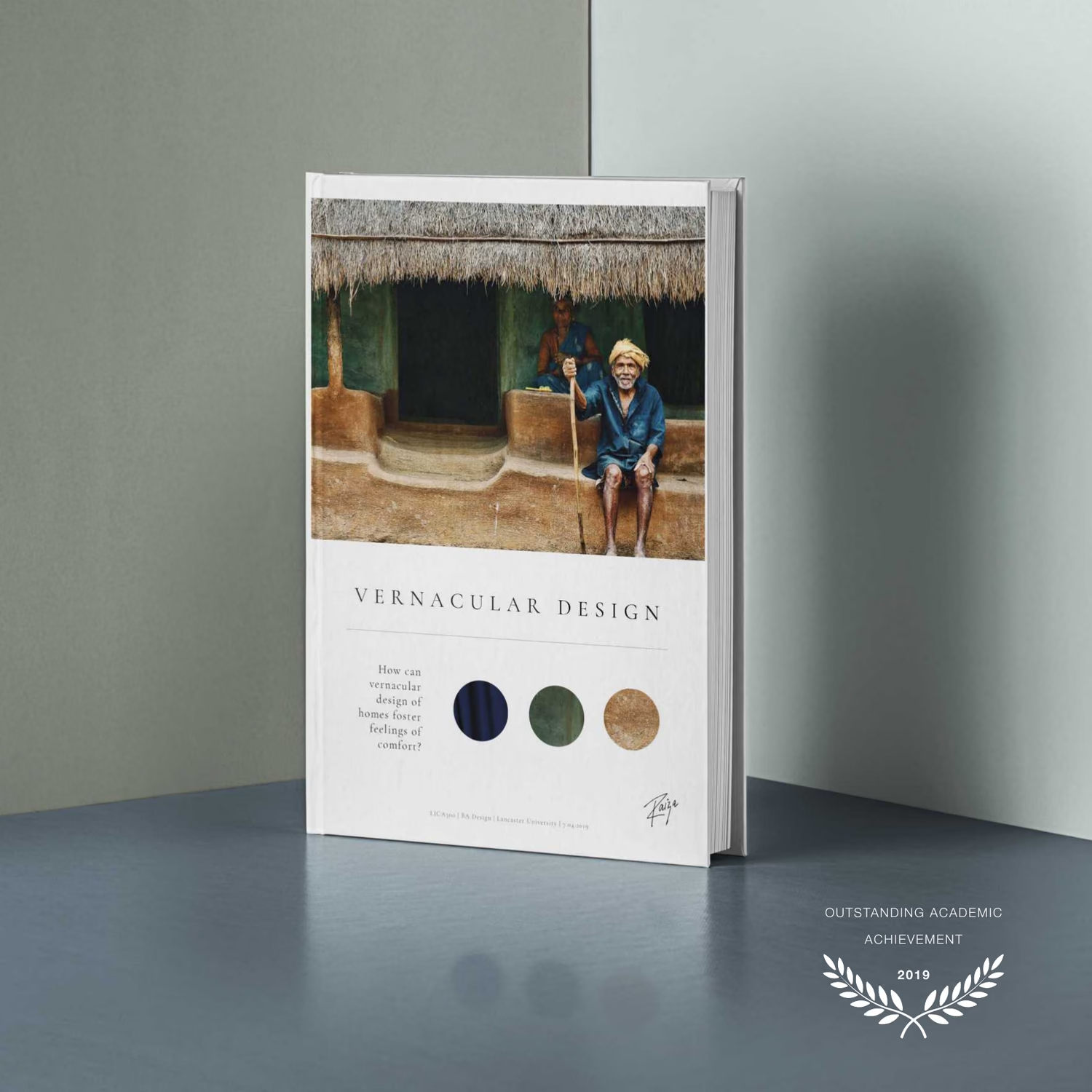
An exploratory study of how the vernacular design of homes can espouse comfort to the people living in them while still promoting sustainability. It takes the Naalukettu — the traditional homestead of Kerala, in south India — and reads it through Heidegger's fourfold: earth, sky, mortals and immortals, and what each of them has to do with a person and the place they have built.

Across sustainability, nature and form, technology, culture and craft, the thesis works out what the vernacular has to say to the homes we build next. The research was done on the ground — site visits to vernacular homes, interviews with the people living in them, with contemporary architects and with the artisans in the crafts village, and a documentary film made while I was there.

Five principles came out of it. Build with locally sourced materials. Let the home amalgamate with nature harmoniously, in a co-existence that transmutes meaning. Hold a balance between utilitarianism and the excessive use of technology. Foster the cultural elements that augment the dweller's spirituality. And take designs from the crafts, while supporting the artisans who keep them alive.

Role
Researcher, writer, designer and filmmaker
Methods
Site visits to vernacular homes, interviews with dwellers, architects and local artisans, documentary film
Recognition
Published in the Lancaster Institute of Contemporary Arts archive under exemplary dissertations; Outstanding Academic Achievement, 2019
The Vernacular Design dissertation as a printed book, standing on end, its cover a photograph of a thatched Kerala homestead

8 pages — swipe, or open one to read it
III

SATO

Service and systems design

Capstone project, Aalto University · 2023

SATO is one of Finland's leading housing providers, with around 25,000 homes across Greater Helsinki, Tampere and Turku. The brief was broad on purpose: how do you build loyalty with tenants, which services would raise quality of life and reduce the risk of marginalisation and segregation, and how does any of that also keep the apartments occupied. Six of us narrowed it to the social side of sustainability, and inside that to cultural diversity.

Research and solution were never cleanly separated — they oscillated, each pulling the other into focus. Over 460,000 people with a foreign background live in Finland, most of them in exactly the large cities SATO has moved towards. The interviews surfaced language barriers, discriminatory internal bias, conflict between neighbours, and the plain difficulty of finding out how to apply for a home in the first place.

The proposal reaches three levels of the iceberg at once. A handbook for tenants, which is the part they can actually see. A competence development programme, which changes what employees are able to do. And a systemic roadmap — motivation, self-assessment, defining strategy, action plan, monitoring — aimed at what stays under the surface: the mental models a company keeps without noticing.

Team
Arttu Kärkkäinen, Matleena Inget, Pamela Ngui, Leo Weißer, Marikki Nygård and me
Methods
Double diamond, tenant and stakeholder interviews, secondary research, affinity mapping, the iceberg model
Outcome
A systemic roadmap, a competence development programme and a tenants' handbook
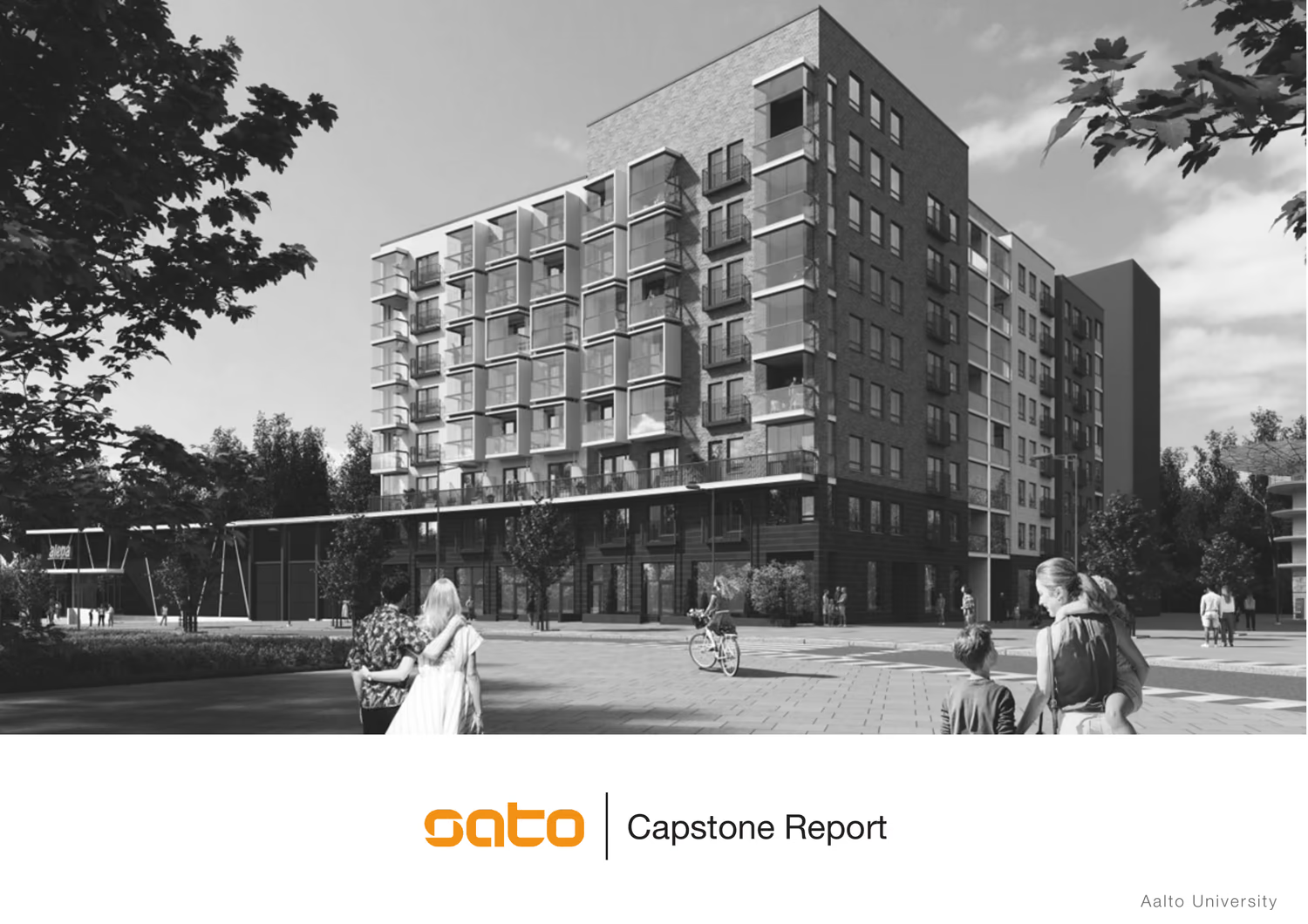
The SATO capstone report cover: a black and white photograph of a SATO housing block with residents crossing the square in front of it

11 pages — swipe, or open one to read it

IV

Espoo City Library Zine Club

Co-design and sustainability education

Group project, Aalto University · 2021

Working with Espoo City Library, our group was asked to explore visualisations of consumption and educational materials for sustainability — informative, engaging, and aimed at a broad group of actors. Mapping the library's stakeholders showed us where the gap really sat. Parents, teachers and other adults have plenty of routes to sustainability knowledge. Children aged 7 to 12 have very few that are both equitable and worth their attention.

So we proposed the Zine Club: a small magazine made by children, through a series of co-design workshops run in the library and in local schools. A launch workshop to get them talking about nature and to name the zine themselves. A comic booklet workshop. A storytelling workshop built around a mascot called Dino and the question of how to help him save energy. And a science experiment workshop where they make pollution catchers, hang them up, and come back a fortnight later to see what the air left behind.

Everything the library would need to run it is in the report — facilitation packs for each workshop, printed and digital invitations, the zine planned out page by page, demonstrative spreads, a web page to download the packs from, and a service blueprint for the whole cycle including the feedback loop into the next issue. The weight of the project sits on the collaborating and the learning; the publication is what makes it real for the children who made it.

Team
Antti Heiskala, Tsai Darren, Kaisa Kytölä, Savannah Vize and me
Methods
Stakeholder mapping, secondary research into co-design, workshop and facilitation design, service blueprinting
Client
Espoo City Library
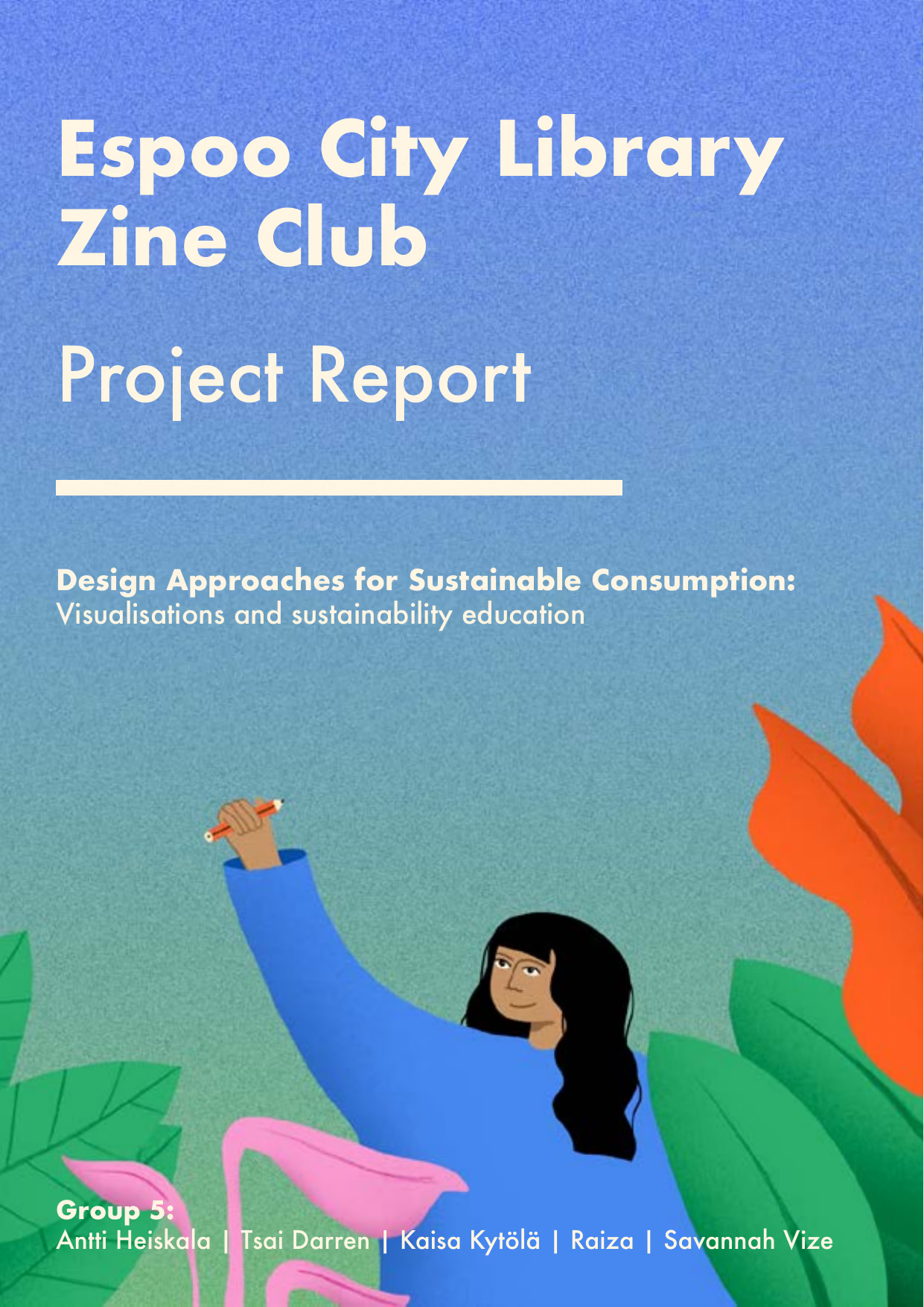
The Espoo City Library Zine Club report cover — a child reaching up among oversized leaves, under the subtitle 'Design approaches for sustainable consumption'

11 pages — swipe, or open one to read it
V

The Muse

Design of spaces

Lancaster University, with Sara · 2019

As I turned around the block in the Northern Quarter of Manchester there was a man telling us about his artwork on that wall — the Doodle on Ducie Street, the collaborative effort of thirty artists experiencing homelessness. That man's brilliance struck a chord in me, and it became the whole project: ways to change experiences and situations for these people by adding value to the art they are already capable of making.

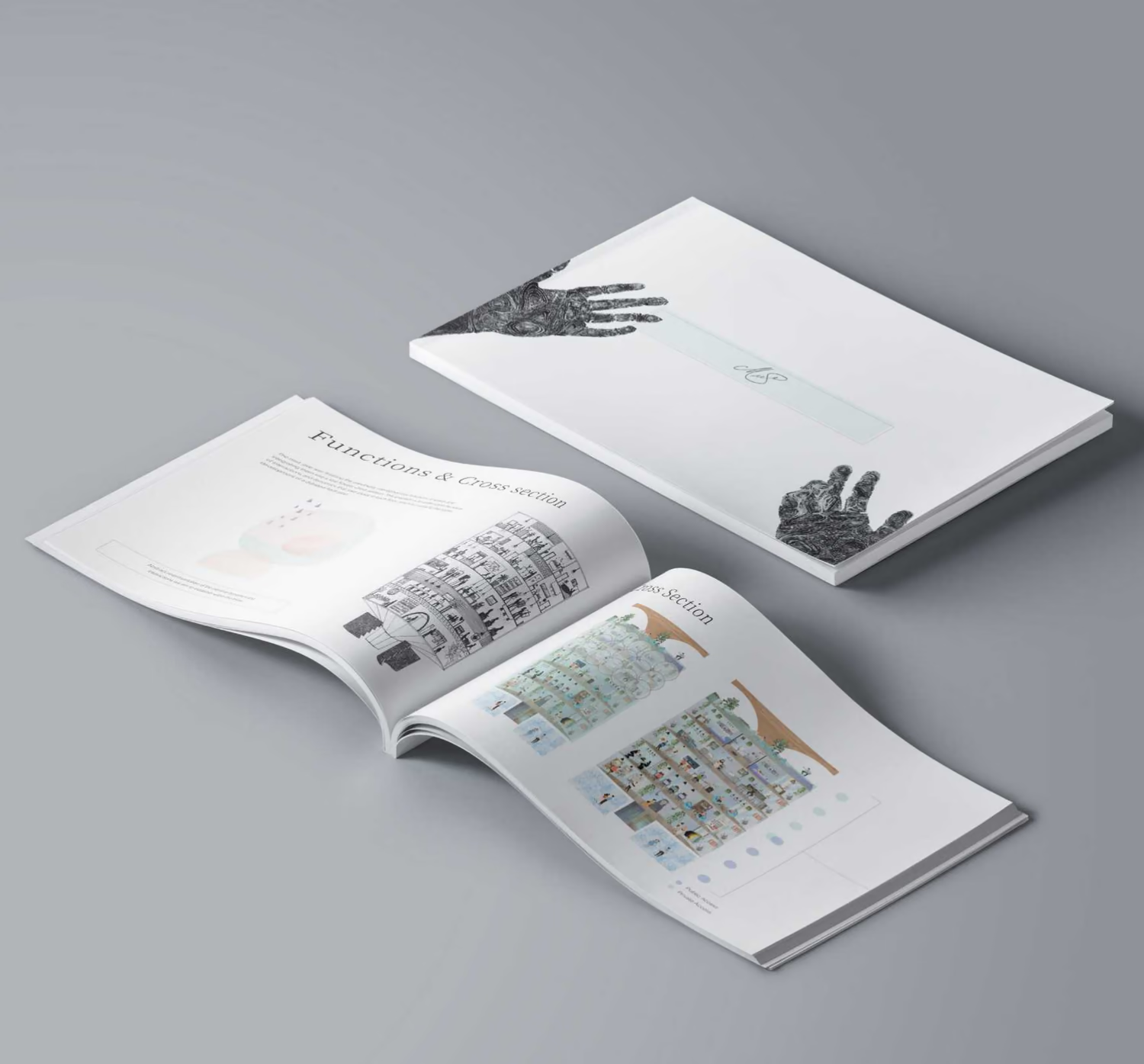
The Muse is a novel and supportive infrastructure that lets creatives experiencing homelessness produce, exhibit and sell their work through interaction with the general public. Sited in the Northern Quarter, it stacks an exhibition space, gallery and shop at street level, offices and design studios above them, apartments above those, and a rooftop over all of it — public access below, private above, so the two meet without anyone being put on show.

A twelve-month residency is meant to leave a resident aware of their own skills, worth and social value. The people who stop to watch the work being made shift what they assume about someone without a home. And the open and communal spaces are there to do the slower work: social connection, shared understanding, a sense of community.

Role
Research and ideation at every stage; the solution of The Muse was mine, structured out alongside my teammate Sara; visual designer of the cross-sections, context images, site analysis and shape exploration; co-author of the book
Made with
Adobe InDesign and Illustrator for the booklet, paper and black marker pen for the sketches, Illustrator for the Muse itself
Recognition
Presented at the Lancaster University Degree Show, 2019
The Muse presented as a printed book, lying open on a grey surface at the functions and cross-sections spread

6 pages — swipe, or open one to read it

VI

ATM Re-design

Empathetic design

Lancaster University · 2018

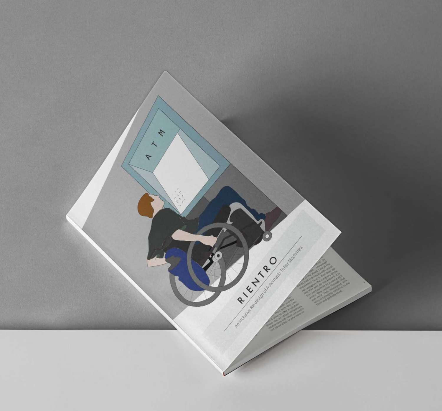
Rientro — the name of this project signifies accessibility. Meticulous research gave an intriguing glimpse into the struggles of wheelchair users and their interactions with the ATM, and the strain it imposes on them can be tactically relieved by a re-design that is highly inclusive to this user group.

The proposal re-arranges the internal mechanisms of the machine to relieve the space below the screen. An indent lets a wheelchair user move inwards, bringing them closer to the screen for smoother use of the service — the freedom of independence, and the privacy that usually gets lost first. Alongside it, a braille-embedded glass over the touchscreen, so the experience stays constant from a visually impaired individual to any other user.

Reach zones and visual fields were drawn out by hand, then built in cardboard. Quick and dirty prototyping released the idea from a veil of ambiguity and gave it clearer definition.

Methods
Secondary reading, interviews, focus groups, observation, bodystorming, physical prototyping
Made with
Adobe InDesign and Illustrator for the booklet and visuals, cardboard boxes for the prototype
Recognition
Presented at the Lancaster Institute of Contemporary Arts
Rientro presented as a printed book, open at the page showing a wheelchair user at a redesigned ATM

4 pages — swipe, or open one to read it
Back to the desk